Driving Under the Influence of Statistics

How the same California crash data can be framed to ‘prove’ almost anything, and what that reveals about data literacy.
MEDS
R
Data Visualization
Author

Emily Miller

Published

March 9, 2026

Introduction

Here’s a statistic: sober drivers cause 88% of all crashes in California. Alarming, right? You might want to reconsider that designated driver situation.

That statistic is real. It comes from the California Highway Patrol’s SWITRS database: tens of thousands of reported crashes from 2024, cleaned, filtered to at-fault drivers, summarized honestly and completely misleading.

Crash Course in Bad Statistics is a deadpan parody of the kind of scary public health PSA you’ve probably scrolled past, with dark backgrounds, bold shocking claims, authoritative(-looking) charts. Every number in it is technically accurate. Every conclusion it nudges you toward is wrong. The goal isn’t to convince you that drunk driving is fine (it isn’t). The goal is to show how easy it is to weaponize real data through selective framing, and to make you a little more suspicious the next time a statistic sounds exactly as alarming as someone needs it to.


The Infographic

A dark PSA-style infographic set inside a car interior illustration. The rearview mirror shows raw crash counts by sobriety (sober drivers: 88%). The dashboard gauges compare crash timing by hour; all crashes peak at rush hour while alcohol-impaired crashes peak at 2am. A roadside billboard shows estimated deaths broken down by gender and sobriety.

Design Process

1. Graphic Form

Each of the three panels uses a conventional chart type: horizontal bar, polar clock (radial bar graph), column bar, chosen specifically because they look trustworthy. The horizontal bar for Myth 1 is the starkest way to display the 7:1 raw count ratio; there’s no visual complexity to distract from the number. The polar clocks for Myth 2 lean into the car dashboard aesthetic of the overall infographic design while also being a genuinely useful format for 24-hour temporal data. The key manipulation there is subtle: the right clock’s y-axis is expanded to 2.2x, which compresses the alcohol bars to fill only about 45% of the clock face, making the late-night peak look minor rather than concentrated. The column bar for Myth 3 is intentionally conventional; the absurdity of the “sober men are deadlier” conclusion lands harder when the chart looks completely normal. All three chart types read as authoritative. That’s the point.


2. Text (Titles, Labels, Annotations)

All titles are all-caps, which registers as alarm or warning, the visual register of a PSA. “SOBER DRIVERS CAUSE MORE CRASHES” is designed to read like a headline before the viewer processes that it’s a chart title. The Myth 3 title uses ggtext::element_markdown() to render “DEADLIER” in red inline, making an absurd claim feel like breaking news. Subtitles carry the technically-true framing without fabricating anything.

The Myth 2 patchwork annotation, “IF DRUNK DRIVING CAUSED THE DANGER, THE PEAKS WOULD ALIGN,” does the most rhetorical work of any text in the infographic. It states the misleading logical argument explicitly so the viewer doesn’t have to make the inferential leap themselves. Presenting the conclusion we want the viewer to draw up front also keeps them from doing too much of their own interpreting and thinking about how the data is represented and what it could mean. Similarly, the Myth 3 dashed reference line is annotated with the cumulative drunk-driver death count so the viewer can immediately make the sober-men-vs-all-drunk comparison without doing math.


3. Themes

All three charts share a dashboard_theme built on theme_void(), which strips all default chart chrome and leaves only the data and explicitly added elements. Near-black backgrounds (#07091E for charts, #0D0F28 for the patchwork panel) establish the night-driving, danger aesthetic immediately. Grid lines exist (#1A2550) but are barely visible, structural scaffolding rather than decoration, keeping the data-ink ratio high. Individual charts override the shared theme as needed: the polar clocks get larger axis text since the labels sit on a curved face; the bar charts suppress x-axis text since the values are labeled directly on the bars.


4. Colors

The palette uses two data accents: #FF3333 (red) for alcohol-impaired and #4DB8FF (blue) for sober. This maps directly onto the danger/safe cultural association; red means stop, blue means calm, which is itself a design manipulation. Blue sober bars that dominate the chart read as the dangerous category, which creates a subtle cognitive dissonance that reinforces the parody’s argument. All typography uses cool whites and blues (#FFFFFF, #A8BCD8, #7A8EBB) against near-black backgrounds for high contrast ratios. On colorblindness: red-blue is readable for deuteranopia (the most common form) but can fail for protanopia. Given that the distinction between the two groups is also encoded in bar position and direct labeling, this is an acceptable tradeoff, though not ideal.


5. Typography

Rajdhani (loaded via sysfonts and showtext) is geometric, condensed, and slightly techno-adjacent; it reads like an instrument panel readout, which fits the dashboard framing. The weight hierarchy is straightforward: bold 35pt titles, 20pt subtitles, 14–25pt axis labels depending on the chart. The larger axis sizes on the polar clocks (25pt) are necessary because the labels orbit the chart face rather than sitting on a flat axis, so they need more visual weight to be legible. showtext_auto() ensures consistent rendering across both PDF and HTML outputs, which matters since the charts were exported to PDF for Affinity assembly before being embedded here. In Affinity, Shatterboxx font was used for “CRASH” and Skyline for “COURSE”. I used blacked out letters from Skyline to continue the pattern across the horizon.


6. General Design

The three R-generated charts were exported as PDFs and assembled in Affinity Designer inside a car interior illustration: rearview mirror, dashboard gauges, and a roadside billboard. That spatial anchoring does the visual hierarchy work: the eye enters through the mirror (Myth 1, the hook), moves to the dashboard gauges (Myth 2, the temporal argument), then lands on the billboard (Myth 3, the punchline). Each panel handles exactly one misleading argument, which keeps information density low and makes each claim feel self-contained. The “CRASH Course / BAD STATISTICS” text painted on the road serves as the satirical frame anchor; it’s the one element that breaks the deadpan and signals that the infographic knows exactly what it’s doing.


7. Contextualizing the Data

Each panel hides the same thing: the denominator. Myth 1 shows raw crash counts without accounting for the fact that sober drivers vastly outnumber drunk drivers on the road, so more exposure means more crashes, regardless of risk per mile. Myth 2 shows crash timing patterns without mentioning that alcohol’s fatality rate is higher at every hour of the day, not just after midnight. Myth 3 uses estimated deaths (crashes × fatality rate) to make the absolute count comparison, but buries the fact that drunk drivers have roughly double the fatality rate of sober drivers in every gender group; when you rank by rate rather than total, the story inverts completely.

This blog post is the contextualization layer. The infographic is designed to be encountered first, to let the misleading framing land; the critique comes second. That sequence is intentional: it’s easier to understand how data manipulation works when you’ve already been manipulated by it.


8. Centering the Primary Message

The infographic’s surface argument is “driving is just dangerous, and you might as well have a good time.” The real message is that framing choices (counts vs. rates, selective time windows, variable substitution) can make the same dataset tell opposite stories, and that this is worth being skeptical about.

The biggest design challenge was tone calibration. Playing it completely straight risks the infographic reading as genuine advocacy for drunk driving, which is the wrong takeaway entirely. The “CRASH Course / BAD STATISTICS” road text was added late in the process specifically to solve this: it’s the one moment where the infographic winks at the viewer. Whether that’s enough of a signal, or whether it needs to be more prominent, was the main feedback question going into peer review.


9. Accessibility

The red-blue palette was checked for deuteranopia readability; the two hues remain distinguishable. Protanopia is a known limitation; red and blue can appear similar, though the distinction is also encoded positionally and through direct bar labeling, which provides a redundant channel. All text is rendered against near-black backgrounds with high contrast ratios, and Rajdhani at the sizes used (14pt minimum) is legible on dark backgrounds. Alt text is provided for the infographic image. Code chunks in the blog body use echo: false so only the output renders; the full code is available in the collapsed chunk at the end for anyone who wants to dig in.


10. DEI Lens

The Myth 3 panel uses a binary gender breakdown (M/F) because SWITRS only records two categories; non-binary drivers are not represented in this data, which is a real limitation worth naming. The analysis reflects who was recorded in crash reports, not the full population of California drivers.

There’s also a broader framing consideration. The “sober men are the real danger” argument the infographic makes is a parody, but it mirrors a genuine rhetorical pattern: using statistics to redirect accountability away from a risky behavior and onto a demographic variable instead. That’s not just a data literacy problem, it’s how policy debates get muddied. The blog post making that connection explicit is the responsible satire move. The infographic alone, without this context, would just be irresponsible.


Reflections

The car interior framing worked better than expected; spatially anchoring each chart to a physical part of the vehicle gave the layout a natural reading order without needing explicit numbering or arrows. The polar clocks in particular felt like the right chart type the moment they were placed inside dashboard gauges.

The harder part was finding the right level of misleading. Early drafts were too obviously wrong; later ones were convincing enough that peer reviewers weren’t sure if the satire was intentional. The road text was a late addition specifically to thread that needle. Whether it lands depends on the reader, which is probably the point, data manipulation works best when it doesn’t feel like manipulation.

What this project revealed most clearly: the gap between “technically accurate” and “honestly communicated” is enormous, and closing it requires deliberate choices at every step of the design process.


Explore the Code

The three charts in this infographic were generated in R using {ggplot2} and assembled in Affinity Designer. The full code is in the expandable chunk below.

Show full code
# ── Setup ─────────────────────────────────────────────────────────────────────
library(tidyverse)
library(here)
library(patchwork)
library(scales)
library(sysfonts)
library(showtext)
library(ggtext)

# Raw files: CA Highway Patrol SWITRS database, crashes + parties CSVs (2024).
# Download portal: https://iswitrs.chp.ca.gov
# Cleaning, filtering to at-fault drivers, and joining the two files is
# documented in exploration.qmd. The processed file was saved there with:
#   write_csv(crash_clean, here("data/processed/crash_clean.csv"))
crash_clean <- read_csv(here("data/processed/crash_clean.csv"),
                        show_col_types = FALSE)

# "rajdhani" is the family name used in all family = "rajdhani" calls below
font_add_google("Rajdhani", "rajdhani")
showtext_auto()

# ── Color palette ─────────────────────────────────────────────────────────────
PAL <- list(
  plot_bg      = "#07091E",  # chart background - deep indigo
  bg           = "#0D0F28",  # page background, used in myth 2 patchwork panel
  alcohol      = "#FF3333",  # red - alcohol-impaired / danger
  sober        = "#4DB8FF",  # blue - sober / safe
  text_primary = "#FFFFFF",  # titles
  text_muted   = "#7A8EBB",  # subtitles
  text_axis    = "#A8BCD8",  # axis labels
  grid_line    = "#1A2550"   # grid lines
)

# ── Shared theme ──────────────────────────────────────────────────────────────
# Applied to all three charts; individual charts add overrides on top.
dashboard_theme <- theme_void() +
  theme(
    plot.background    = element_rect(fill = PAL$plot_bg, color = NA),
    panel.background   = element_rect(fill = PAL$plot_bg, color = NA),
    panel.grid.major.y = element_line(color = PAL$grid_line),
    axis.text.x = element_text(
      color = PAL$text_axis, size = 25,  # large enough to read on polar clock face
      face = "bold", family = "rajdhani"
    ),
    plot.title = element_text(
      color = PAL$text_primary, hjust = 0.5,  # centered
      face = "bold", family = "rajdhani",
      size = 35, margin = margin(b = 2)        # tight gap below title
    ),
    plot.subtitle = element_text(
      color = PAL$text_muted, hjust = 0.5,    # centered
      size = 20, family = "rajdhani",
      margin = margin(t = 2, b = 6)           # small top, more breathing room below
    ),
    plot.margin = margin(10, 15, 8, 15)        # top right bottom left
  )


# ── Visualization 1: Myth 1 ───────────────────────────────────────────────────
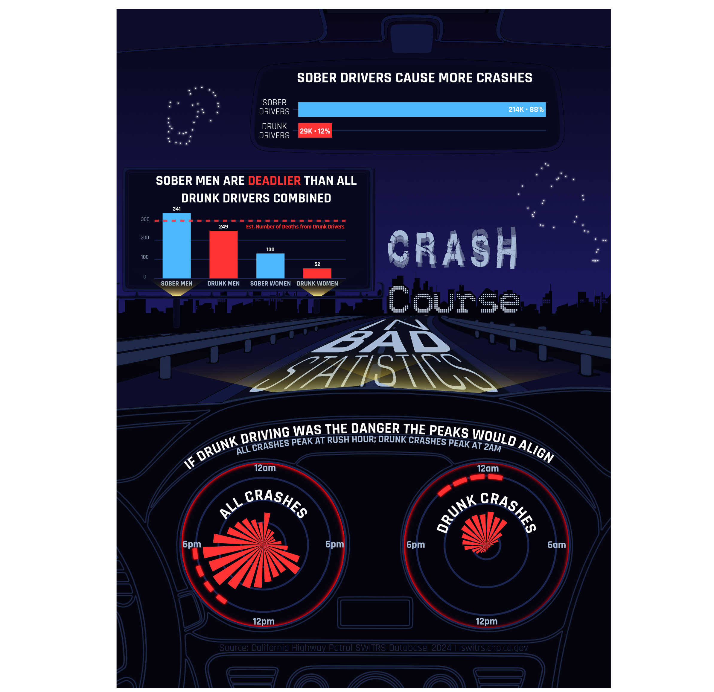
# "Sober Drivers Don't Cause Most Crashes"
# Shows raw crash counts by sobriety. Sober drivers account for ~88% of crashes.
# By reporting counts instead of rates, the chart makes sober driving look like
# the bigger danger - technically true, deliberately misleading.

fmt_n <- label_number(scale_cut = cut_short_scale())

myth1_data <- crash_clean |>
  filter(!is.na(sobriety)) |>
  distinct(collision_id, sobriety) |>
  count(sobriety) |>
  mutate(
    pct    = round(n / sum(n) * 100),
    driver = if_else(sobriety == "No alcohol", "SOBER\nDRIVERS", "DRUNK\nDRIVERS"),
    label  = paste0(fmt_n(n), "  \u00b7  ", pct, "%  ")
  )

ggplot(myth1_data, aes(x = n, y = reorder(driver, n), fill = sobriety)) +
  geom_col(width = 0.7) +              # narrower than default; breathing room between bars
  geom_text(
    aes(label = label),
    hjust = 1.05,                      # flush against right edge of bar, inside
    color = "white", family = "rajdhani", fontface = "bold", size = 6
  ) +
  scale_fill_manual(
    values = c("No alcohol" = PAL$sober, "Alcohol impaired" = PAL$alcohol),
    guide  = "none"
  ) +
  scale_x_continuous(expand = expansion(mult = c(0.02, 0))) +   # left padding
  labs(
    title    = "SOBER DRIVERS CAUSE MORE CRASHES",
    subtitle = "Raw crash counts \u00b7 CA SWITRS 2024",
    x = NULL, y = NULL
  ) +
  dashboard_theme +
  theme(
    axis.text.y = element_text(color = PAL$text_axis, size = 18, family = "rajdhani"),
    axis.text.x = element_blank(),
    panel.grid  = element_blank()
  )

ggsave("myth1.pdf")


# ── Visualization 2: Myth 2 ───────────────────────────────────────────────────
# "Drunk Driving Makes the Roads Dangerous for Everyone"
# Juxtaposes crash timing for all crashes (left, morning rush peak) against
# alcohol-impaired crashes (right, 2am peak - shown at 2.2x expanded y-scale
# to make the pattern look minor). The mismatch implies drunk driving can't be
# responsible for the most dangerous conditions.

all_crashes <- crash_clean |>
  distinct(collision_id, hour) |>
  count(hour)

alc_crashes <- crash_clean |>
  filter(sobriety == "Alcohol impaired") |>
  distinct(collision_id, hour) |>
  count(hour)

# Peak-hour indicator ring positions (top 4 hours in each panel)
all_peaks <- all_crashes |>
  slice_max(n, n = 4, with_ties = FALSE) |>
  pull(hour)

alc_peaks <- alc_crashes |>
  slice_max(n, n = 4, with_ties = FALSE) |>
  pull(hour)

all_limit <- max(all_crashes$n, na.rm = TRUE) * 1.22
alc_limit <- max(alc_crashes$n, na.rm = TRUE) * 2.2

all_ring <- tibble(hour = all_peaks, ring_y = all_limit * 0.93)
alc_ring <- tibble(hour = alc_peaks, ring_y = alc_limit * 0.93)

all_ring_h <- all_limit * 0.06
alc_ring_h <- alc_limit * 0.06

# Extra margin + clip off so polar axis labels don't get chopped at panel edges
myth2_clock_theme <- theme(
  panel.grid.major.y = element_line(color = PAL$grid_line, linewidth = 0.7),
  plot.title    = element_text(color = PAL$text_primary, hjust = 0.5, face = "bold", family = "rajdhani", size = 18),
  plot.subtitle = element_text(color = PAL$text_muted,   hjust = 0.5, family = "rajdhani", size = 12),
  axis.text.x   = element_text(
    color = PAL$text_axis, size = 16, face = "bold", family = "rajdhani",
    margin = margin(t = 4, r = 4, b = 4, l = 4)
  ),
  plot.margin   = margin(12, 28, 18, 28)
)

p_all <- ggplot(all_crashes, aes(x = factor(hour, levels = 0:23), y = n)) +
  geom_col(width = 0.72, fill = PAL$alcohol) +   # slight gap between clock segments
  geom_tile(
    data = all_ring,
    inherit.aes = FALSE,
    aes(x = factor(hour, levels = 0:23), y = ring_y),
    fill = PAL$alcohol, alpha = 0.95, width = 0.6, height = all_ring_h
  ) +
  coord_polar(clip = "off") +
  scale_x_discrete(
    breaks = c("0", "6", "12", "18"),   # label quarter-hours only
    labels = c("12am", "6am", "12pm", "6pm")
  ) +
  scale_y_continuous(
    limits = c(0, all_limit),
    expand = expansion(mult = c(0, 0))
  ) +
  labs(
    title    = "ALL CRASHES BY HOUR",
    subtitle = "Morning commute is the deadliest window"
  ) +
  dashboard_theme +
  myth2_clock_theme

# Expanded y-axis so alcohol bars only reach ~45% of clock face,
# making the pattern look minor and clearly misaligned with the left chart
p_alc <- ggplot(alc_crashes, aes(x = factor(hour, levels = 0:23), y = n)) +
  geom_col(width = 0.72, fill = PAL$alcohol) +
  geom_tile(
    data = alc_ring,
    inherit.aes = FALSE,
    aes(x = factor(hour, levels = 0:23), y = ring_y),
    fill = PAL$alcohol, alpha = 0.95, width = 0.78, height = alc_ring_h
  ) +
  coord_polar(clip = "off") +
  scale_x_discrete(
    breaks = c("0", "6", "12", "18"),
    labels = c("12am", "6am", "12pm", "6pm")
  ) +
  scale_y_continuous(
    limits = c(0, alc_limit),           # 2.2x makes bars fill ~45% of face
    expand = expansion(mult = c(0, 0))
  ) +
  labs(
    title    = "ALCOHOL-IMPAIRED CRASHES BY HOUR",
    subtitle = "Fewer crashes -- and the peak doesn't match"
  ) +
  dashboard_theme +
  myth2_clock_theme

p_all + p_alc +
  plot_annotation(
    title = "IF DRUNK DRIVING CAUSED THE DANGER, THE PEAKS WOULD ALIGN",
    theme = theme(
      plot.title = element_text(
        color = PAL$text_primary, hjust = 0.5,   # centered over both panels
        face = "bold", family = "rajdhani", size = 14
      ),
      plot.background = element_rect(fill = PAL$bg, color = NA),
      plot.margin = margin(4, 4, 4, 4)
    )
  ) &
  theme(
    plot.background  = element_rect(fill = PAL$plot_bg, color = NA),
    panel.background = element_rect(fill = PAL$plot_bg, color = NA)
  )

ggsave("myth2.pdf")


# ── Visualization 3: Myth 3 ───────────────────────────────────────────────────
# "Drunk Driving Is What's Killing Californians"
# Breaks down estimated deaths (crashes x fatality rate) by gender and sobriety.
# Sober men account for more estimated deaths than all drunk drivers combined.
# The dashed reference line marks the sum of estimated deaths across both drunk
# driver groups.

myth3_data <- crash_clean |>
  filter(!is.na(sobriety), gender_code %in% c("M", "F")) |>
  distinct(collision_id, gender_code, sobriety, fatal) |>
  group_by(gender_code, sobriety) |>
  summarize(
    est_deaths = round(n() * mean(fatal, na.rm = TRUE)),
    .groups    = "drop"
  ) |>
  mutate(
    group_label = case_when(
      gender_code == "M" & sobriety == "No alcohol"       ~ "SOBER MEN",
      gender_code == "M" & sobriety == "Alcohol impaired" ~ "DRUNK MEN",
      gender_code == "F" & sobriety == "No alcohol"       ~ "SOBER WOMEN",
      gender_code == "F" & sobriety == "Alcohol impaired" ~ "DRUNK WOMEN"
    ),
    group_label = factor(
      group_label,
      levels = c("SOBER MEN", "DRUNK MEN", "SOBER WOMEN", "DRUNK WOMEN")
    )
  )

# Sum of estimated deaths for drunk men + drunk women combined
all_drunk <- myth3_data |>
  filter(sobriety == "Alcohol impaired") |>
  pull(est_deaths) |>
  sum()

ggplot(myth3_data, aes(x = group_label, y = est_deaths, fill = sobriety)) +
  geom_col(width = 0.6) +    # narrower columns; more whitespace between groups
  geom_hline(
    yintercept = all_drunk,
    linetype = "dashed", color = PAL$alcohol, linewidth = 0.8, alpha = 0.8
  ) +
  annotate(
    "text",
    x = 0.6, y = all_drunk - 18,   # left of first bar, above reference line
    label = paste0("Est. Number of Deaths from Drunk Drivers - Cumulative: ", all_drunk),
    color = PAL$alcohol, hjust = -.95,
    family = "rajdhani", size = 4.2
  ) +
  geom_text(
    aes(label = est_deaths),
    vjust = -0.4,   # just above bar top
    family = "rajdhani", fontface = "bold", size = 4.5,
    color = "white"
  ) +
  expand_limits(y = max(myth3_data$est_deaths) * 1.2) +   # 20% headroom for value labels
  scale_fill_manual(
    values = c("Alcohol impaired" = PAL$alcohol, "No alcohol" = PAL$sober),
    guide  = "none"
  ) +
  labs(
    title    = "SOBER MEN ARE <span style='color:#FF3333'>DEADLIER</span><br>THAN ALL DRUNK DRIVERS COMBINED",
    subtitle = "Estimated deaths = crashes \u00d7 fatality rate, by gender and sobriety",
    x        = NULL,
    y        = "Estimated deaths"
  ) +
  dashboard_theme +
  theme(
    axis.text.x        = element_text(color = PAL$text_axis, size = 14, family = "rajdhani"),
    axis.text.y        = element_text(color = PAL$text_axis, size = 14, family = "rajdhani"),
    panel.grid.major.y = element_line(color = PAL$grid_line),
    panel.grid.major.x = element_blank(),
    plot.title         = element_markdown(   # allows HTML color span in title
      color = PAL$text_primary, hjust = 0.5,
      face = "bold", family = "rajdhani",
      size = 35, margin = margin(b = 2)
    )
  )

ggsave("myth3.pdf")